Case study · 1 month
Iterative Product Design | ClassLink
Partnered with leadership and development to evolve OneData into a more cohesive and user-centered product.
- See it live!
- 1 month
- Role
- UI/UX Designer
- Scope
- End-to-end Design, Iterative Design
The problem
What needed solving
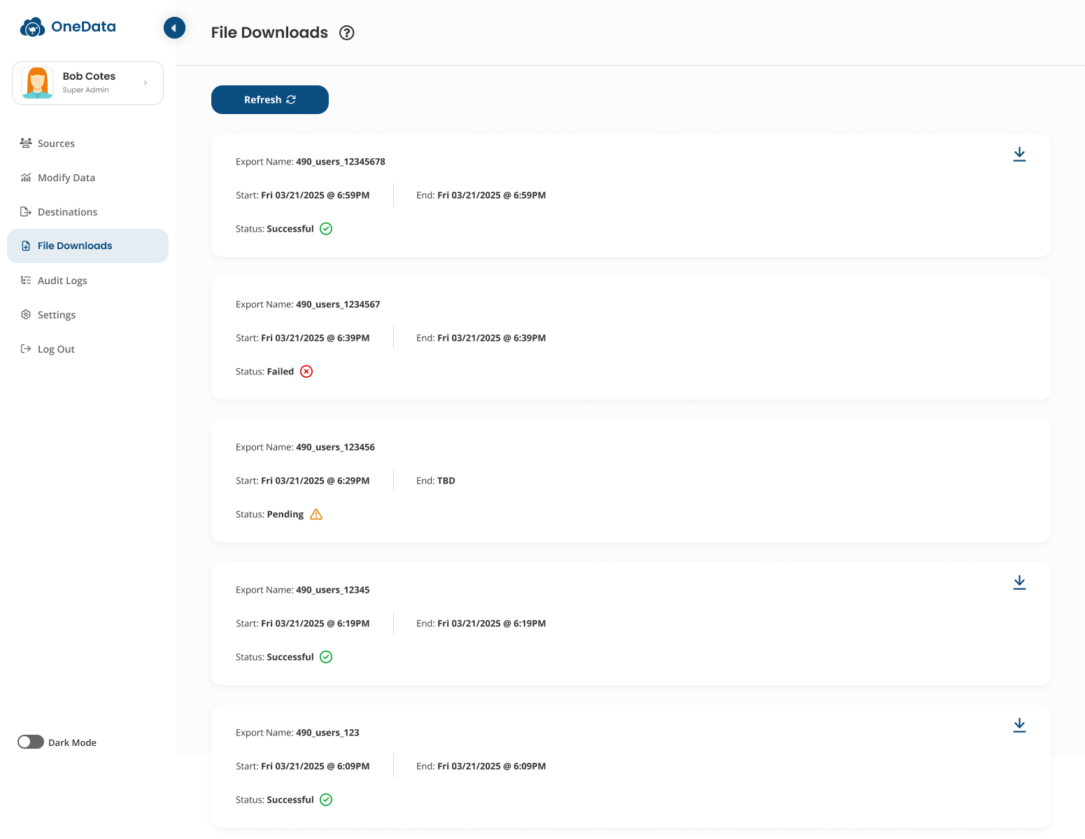
The existing experience required users to leave their workflow to manage exports, while the card-based layout made growing export histories difficult to scan. We needed a solution that was compact, scannable, and built to scale.
The outcome
What shipped
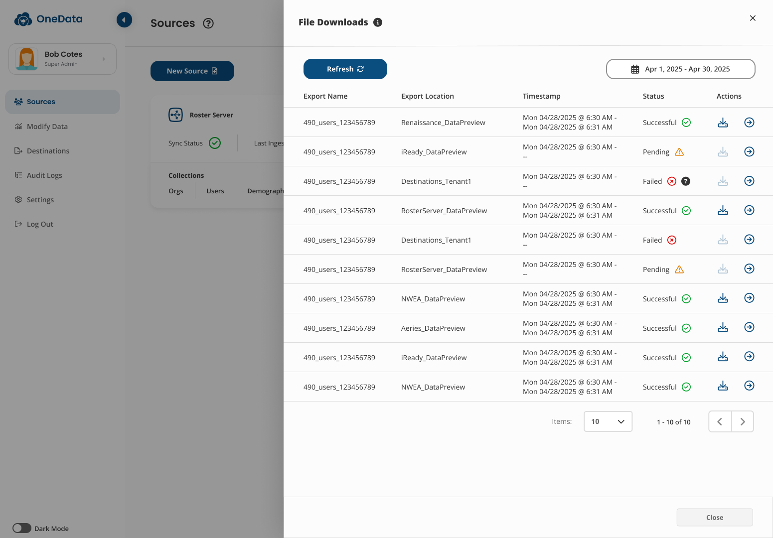
We redesigned the experience as a structured table within a compact modal, keeping key export details and actions visible while supporting larger datasets. The result: a faster, more scalable way to find and manage exports.
- More information at a glance: Users can scan multiple exports at once instead of opening individual cards.
- Fewer steps to manage exports: Export status, details, and actions are accessible directly within the existing workflow.
- Built to scale: The table structure, pagination, and filtering can accommodate growing export histories without adding visual clutter.
Process
So what happened?
Define
As OneData evolved, we wanted to bring export management into the existing workflow instead of sending users to a separate page.
But moving the experience into a smaller modal introduced new constraints:
- Less space to display information
- Export history still needed to remain accessible
- The number of exports would continue to grow
- *The question:** How might we preserve the clarity of a full-page experience within a compact interface?
Explore
I explored different ways to restructure the existing export experience while keeping key information visible and easy to find.
I focused on three goals:
- Visibility: Keep export statuses and details easy to scan
- Efficiency: Reduce interactions needed to find recent exports
- Scalability: Support growing export histories within a smaller space
This led me away from simply shrinking the existing page and toward rethinking the information structure itself.
Optimize
I redesigned the card-based experience into a structured data table optimized for scanning.
The new design now:
- Displays more exports at once
- Keeps names, locations, timestamps, statuses, and actions visible
- Uses icons and visual indicators for quick status recognition
- Adds pagination and filtering for larger datasets
The result was a more compact and scalable workflow that allowed users to find and manage exports with less effort.
Contact
Want to see more?
I am based in the NYC Metropolitan area and am open to full-time roles with immediately availability!
minahchong.design@gmail.com